Visualization Tutorial for Comparisons
The ORKG provides you with the possibility to create visualizations for numeric properties of comparisons. This is how you do it:
-
Step 1: Sign in
-
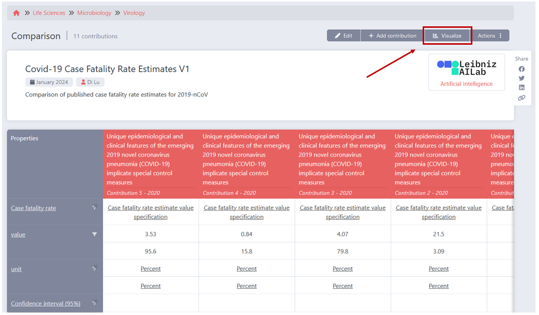
Step 2: Find and open the comparison that you want to add a visualization to. Then, in the Comparison View, click on the Visualize button.
-
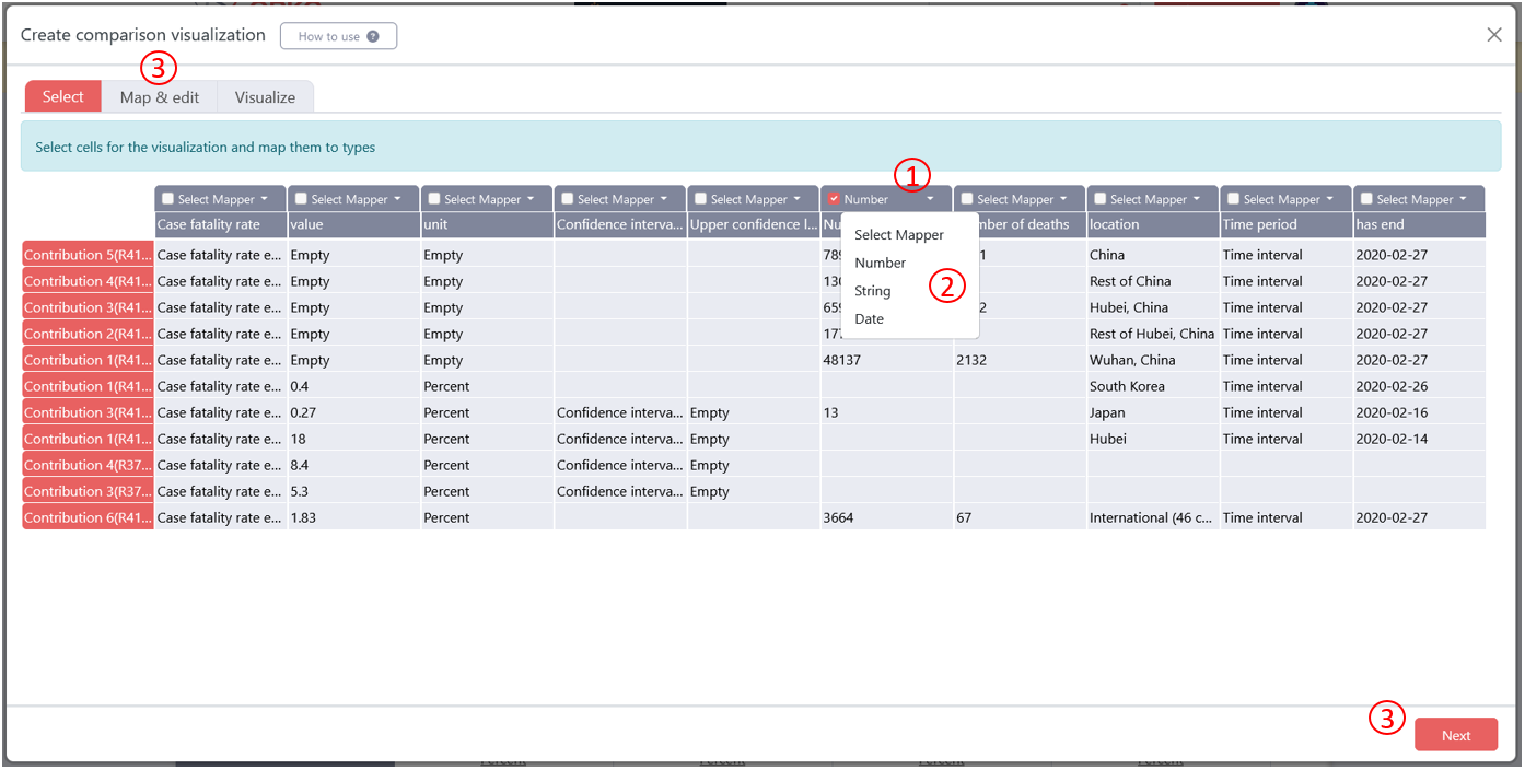
Step 3: A pop-up appears that lets you specify which data you want to visualize and how you want to visualize it. (1) You need to select the columns, i.e. the properties, that you want to include in your visualization by checking the respective box in the table header. (2) Then, you need to select the type of data that is represented in that column. You can choose from three types in the drop down: Number, String or Date. (3) Now you can move to the next step by either clicking on Next in the bottom right or clicking on the next tab Map & edit
-
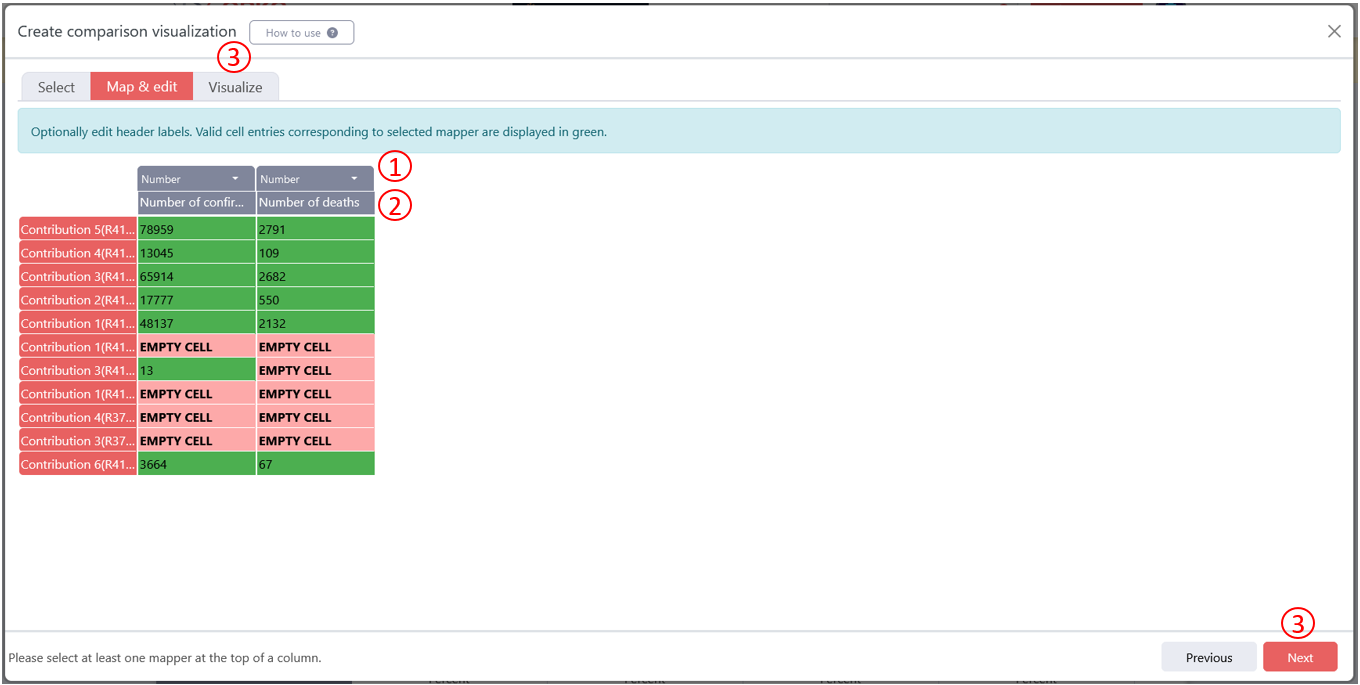
Step 4: On the Map & edit tab you have again the chance to select the right type of data for each column (1). The green cells indicate that the value found in the cell matches the data type that has been selected. (2) Then, you also have the opportunity to change the name of the column to something that you want displayed in the final visualization. (3) Once you are happy with that, you are ready to move on to the last step by clicking on Next or on the Visualize tab.
-
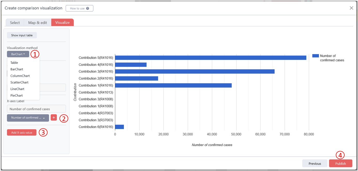
Step 5: (1) Choose the type of visualization that you want to create. (2) Next, choose the variables that should be displayed on the axes. (3) You can also add additional variables for the X-axis. If you are happy with the result shown in the preview, (4) you can publish the visualization. A published visualization will appear on the comparison view of the comparison it belongs to.
If you need some visual guidance, have a look at this video.
If you would like the scientific background, you can read this publication: - Vitalis Wiens, Markus Stocker, Sören Auer: Towards Customizable Chart Visualizations of Tabular Data Using Knowledge Graphs. ICADL 2020: 71-80
What next?
-
Learn more about Comparisons in general: Comparison Course
-
Click here to check out our inbuilt graph visualization tool for papers.